Get your free copy of this award winning book.
Phew! I’ve been updating my book details over the past few weeks, and it is a daunting task, let me tell you! It’s something that has been on my radar for some time now, but I just didn’t have the time (read: gumption) to do it until recently.
Just what am I talking about?
Well, for those that aren’t in the book business, every once in a while it behoves indie authors to refresh such important details such as keywords, categories, book descriptions, and even covers on all the various online platforms. It’s even a good idea to check ebook interiors for broken links and the like. Unfortunately, if you find such a link, it means fixing, reformatting and re-uploading… all time-consuming tasks.
I am super happy to say that I made it through my rather long list. As far as I can tell, all links work, all mistakes are fixed, keywords have been refreshed, categories revamped and added, and many more details have been added or changed. (We’re talking twenty titles that needed refreshing!)
As we speak, I am still working on both books in the NEIGHBOURS Series, and I also plan to make it into a boxed set. The reason I am slow at finishing these last few updates is, well, I’m in a bit of a quandary…
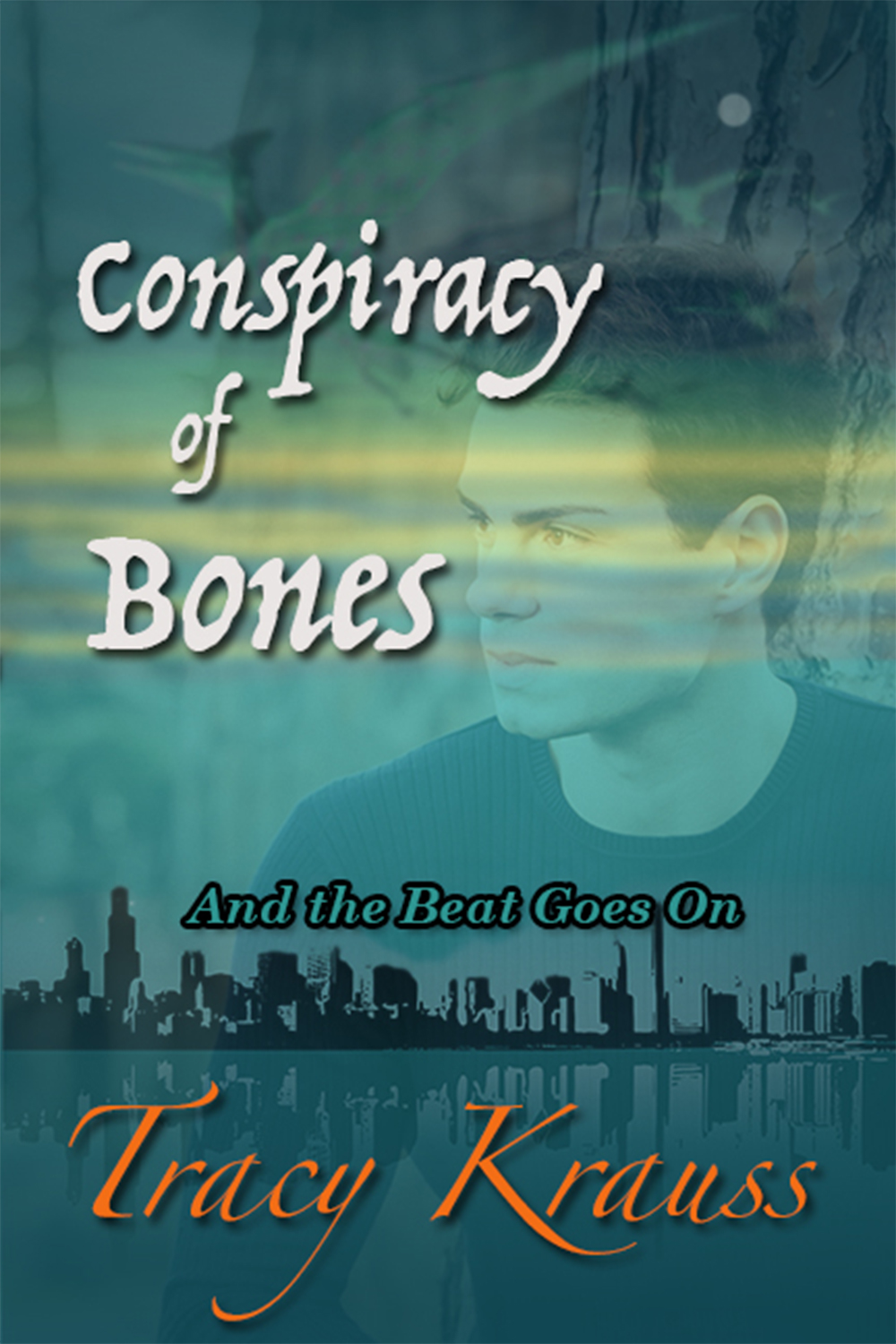
I’ve thought for a while now that the covers for these books need refreshing. They are a bit ‘busy’ and although I love the character photos, my research says I need something more contemporary.
Which option do you prefer?
 Option #1 is what I’m calling the ‘grunge/retro look. I happen to like it a lot but I’m not sure it is trending…
 Option #2 is more on-trend right now. Super simple. Pastel colours. Quite ‘flat’.
 Option #3 is almost the same as #2 but with a bit more detail around the buildings.
 Options #4 is a simplified and refreshed version of the current covers without the people.
 Option #5 is almost exactly the same as the current covers with just a bit of a refresh in terms of the lettering.
So, which do you prefer? What is it about the one you like best that makes you like it? Would any of these covers entice you to buy?
Please leave a comment in the comment section. This is so not scientific by any means, but… I do appreciate the input!
Hmmmm. These covers don’t say ‘contemporary Christian romance’ to me. If you didn’t say that right on the cover, I wouldn’t know that was the genre you were aiming for.
#1 feels cold and doesn’t resonate as ‘romance’ at all. I’d expect something like a detective/crime novel to be inside. Something kind of dark and gritty. Maybe set in the tenements of New York.
#2 and 3 look more like a romance than the others. They have a lighter, more playful feel—if it’s on trend for the genre then it will likely sell. Looking at those covers, I would expect a lighthearted, maybe humorous story. I like these ones the best.
#4 and 5 are too busy, they feel frantic.
I recognize that the stories are set in Calgary and as a Calgary native I appreciate the skyline etc, but if the series is contemporary romance, the skyline would work better as a funky silhouette or something.
If these are not actually ‘romance’ and more along the lines of ‘contemporary women’s fiction’ then you can be a little grittier, but I’d recommend warming them up a bit. Maybe use silhouettes of people or something. A different font. Just my two cents. 🙂
This is exactly the type of feedback I am looking for Janelle! Thank you so much. A few other people also noted that option 1 looked too dark for a humourous and light romance series – probably more suited to mystery or suspense. I am probably going with option two with some modifications such as tweaking the fonts and colours etc. Thanks again!
What I like about 2 & 3 is that the titles and your name are clear and readable. I like 3 better than 2.
However, I like #1 better if it wasn’t quite as dark and the font showed up better.
I still like the real photos of the original covers, but again, the words disappear.
Yes! this is exactly the kind of detailed feedback I need. I am very unsure about this (although narrowing it down because of this good kind of feedback!) thanks. I will take your suggestions into consideration.
I think I like option #1 best. Numbers 2 and 3 are so trendy that it feels like I’ve already seen them. I like option #4 too. It’s not as busy as 5.
But not a big change.
Option 1 is a totally new look.
I agree. I like 2 & 3 but perhaps they are a bit too similar to everything else out there…